
Mobile navigation has evolved dramatically over the past few years, and 2025 brings new challenges and opportunities for UI/UX professionals. With mobile devices accounting for over 58% of global web traffic, creating intuitive and user-friendly mobile navigation isn't just important, it's critical for business success. This comprehensive guide will walk you through everything you need to know about designing mobile navigation that converts visitors into loyal users.
The stakes for mobile navigation design have never been higher. Users now expect seamless, instant experiences across all devices, and a poorly designed navigation system can lead to a 40% increase in bounce rates. Google's mobile-first indexing means your mobile navigation directly impacts your SEO rankings, making it both a user experience and business imperative.
Modern users exhibit distinct mobile behavior patterns that differ significantly from desktop usage. They're often multitasking, have shorter attention spans, and expect thumb-friendly interactions. Understanding these behaviors is the foundation of creating effective mobile navigation systems.
The thumb zone concept remains crucial in 2025. Research shows that 49% of users navigate mobile apps using only their thumb, making the thumb reach the primary consideration for navigation placement. The most accessible area for thumb interaction is the bottom third of the screen, particularly the bottom-right corner for right-handed users and bottom-left for left-handed users.
When designing navigation elements, ensure primary actions fall within the natural thumb reach area. This means reconsidering traditional top-heavy navigation patterns and embracing bottom-aligned or side-accessible navigation systems.
Mobile screens have limited real estate, making progressive disclosure essential. This principle involves showing users only what they need at each stage of their journey, gradually revealing more options as they dive deeper into the interface.
Implement progressive disclosure through:
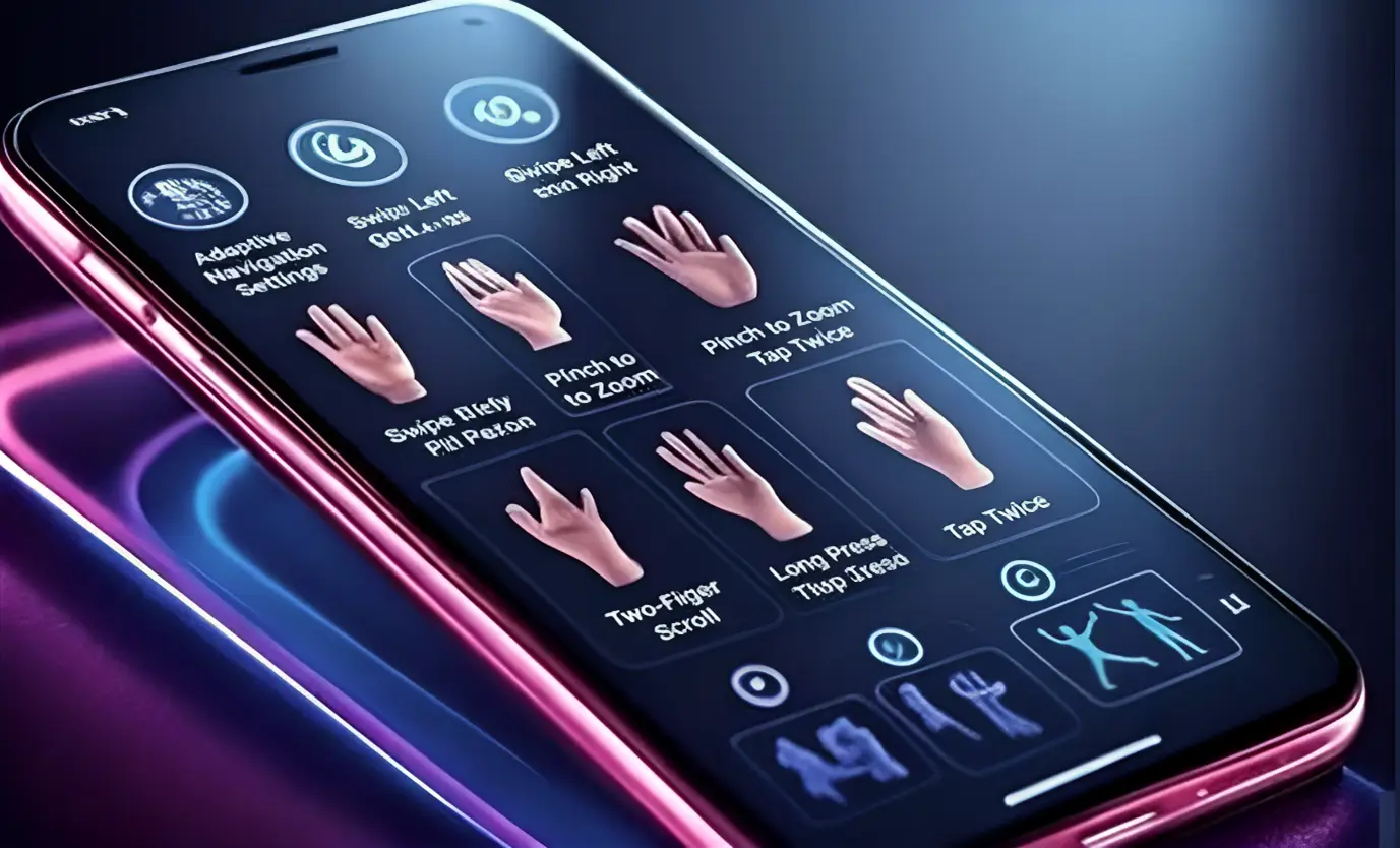
2025 brings sophisticated gesture recognition capabilities that enhance mobile navigation. Users now expect swipe, pinch, and long-press interactions to be intuitive and responsive. Implement gesture-based navigation thoughtfully:

Bottom tab navigation has emerged as the gold standard for mobile apps and progressive web applications. This pattern places primary navigation at the bottom of the screen, within easy thumb reach. It's particularly effective for apps with 3-5 main sections.
Best Practices for Bottom Tab Navigation:
The hamburger menu has evolved significantly from its controversial early days. When implemented correctly, it remains an effective solution for content-heavy applications. The key is making it discoverable and ensuring it doesn't hide critical functionality.
This pattern combines the accessibility of bottom tabs with the flexibility of hidden navigation. It displays the most important 4 sections as tabs and groups additional options under a "More" tab.
This approach works well for applications with extensive functionality while maintaining clean visual hierarchy and easy access to primary features.
Floating Action Button (FAB) Navigation
FAB navigation centers around a prominent circular button that reveals additional navigation options when tapped. This pattern works exceptionally well for task-oriented applications where users have clear primary actions.
Implementing Effective FAB Navigation:
Artificial intelligence and machine learning are enabling adaptive navigation systems that learn from user behavior and adjust accordingly. These systems can:
Voice interfaces are becoming increasingly sophisticated, offering hands-free navigation options. Implement voice navigation by:
Advanced gesture recognition enables fluid, natural navigation experiences. Modern implementations include:
Creating inclusive mobile navigation ensures your application serves users with diverse abilities and needs. Accessibility isn't just ethical—it's also good business, as accessible designs typically provide better experiences for all users.
Touch Target Sizing: Ensure all interactive elements meet minimum size requirements. Apple's Human Interface Guidelines recommend 44x44 points, while Google's Material Design suggests 48x48 density-independent pixels.
Color and Contrast: Maintain sufficient color contrast ratios (4.5:1 for normal text, 3:1 for large text) and don't rely solely on color to convey information. Use icons, text labels, and visual indicators to support color-based distinctions.
Screen Reader Compatibility: Implement proper semantic markup and ARIA labels to ensure screen readers can interpret navigation elements correctly. Provide clear, descriptive labels for all interactive elements.
Focus Management: Ensure keyboard and assistive technology users can navigate efficiently through your interface. Implement logical focus order and visible focus indicators.
Navigation performance directly impacts user satisfaction and SEO rankings. Slow or unresponsive navigation can frustrate users and increase bounce rates significantly.
First Input Delay (FID): Measure the time from when users first interact with navigation elements to when the interface responds. Target FID under 100 milliseconds for optimal user experience.
Cumulative Layout Shift (CLS): Ensure navigation elements don't shift unexpectedly during loading. Stable navigation reduces user frustration and improves perceived performance.
Touch Response Time: Navigation elements should provide immediate visual feedback upon touch. Implement touch states and animations that acknowledge user interactions within 16 milliseconds.
Effective mobile navigation requires comprehensive testing across devices, user groups, and usage contexts. Implement a multi-faceted testing approach to ensure your navigation works for all users.
Usability Testing: Conduct structured usability tests with representative users performing realistic tasks. Focus on navigation efficiency, error rates, and user satisfaction.
A/B Testing: Test different navigation patterns with real users to identify which approaches drive better engagement and conversion rates.
Accessibility Testing: Use both automated tools and manual testing with assistive technologies to ensure navigation works for users with disabilities.
Performance Testing: Measure navigation performance across different devices, network conditions, and usage scenarios.
At Secuodsoft, we've implemented these mobile navigation principles across multiple mobile applications for clients ranging from startups to enterprise organizations. Through our experience developing mobile apps in industries like e-commerce, healthcare, and fintech, we've learned that successful mobile navigation requires balancing user expectations with business objectives.
Our most valuable insights have come from projects where we've had to redesign existing navigation systems. These experiences have taught us that even small navigation improvements can significantly impact user satisfaction and app engagement. The key is always extensive user testing and iterative refinement based on real usage patterns and feedback.
Our development team has found that the most successful mobile navigation projects involve close collaboration between UX designers, developers, and stakeholders from the project's inception. This collaborative approach ensures that navigation design decisions are technically feasible, user-centered, and aligned with business goals.
Learning from common pitfalls can save significant time and improve user experience outcomes.
Overcomplicated Menu Structures: Avoid deep hierarchies that require multiple taps to reach important content. Flatten navigation where possible and surface frequently-used items.
Inconsistent Navigation Patterns: Maintain consistent navigation behavior throughout your application. Users should never have to relearn how navigation works on different screens.
Poor Touch Target Sizing: Small or closely-spaced navigation elements lead to accidental taps and user frustration. Always prioritize adequate spacing and sizing.
Hidden Critical Functions: Don't hide essential features behind obscure navigation patterns. If users can't find key functionality, they'll abandon your application.
As we progress through 2025, several emerging trends are reshaping mobile navigation design:
AI-Powered Personalization: Navigation systems that adapt to individual user preferences and behaviors will become increasingly sophisticated.
Contextual Computing: Navigation that responds to user location, time, and activity will provide more relevant and timely experiences.
Augmented Reality Integration: AR-enhanced navigation will blur the lines between digital interfaces and physical environments.
Multi-Modal Interfaces: Combining touch, voice, and gesture inputs will create more flexible and accessible navigation experiences.
Creating user-friendly mobile navigation in 2025 requires balancing established principles with emerging technologies and user expectations. Focus on understanding your users' needs, implementing proven patterns thoughtfully, and continuously testing and refining your approach.
Remember that great mobile navigation is invisible - users should be able to accomplish their goals efficiently without thinking about the navigation system itself. When you achieve this transparency, you've created a truly user-friendly mobile experience that drives engagement, satisfaction, and business success.
The investment in thoughtful mobile navigation design pays dividends through improved user retention, higher conversion rates, and better search engine rankings. As mobile usage continues to grow, the organizations that prioritize excellent mobile navigation will have significant competitive advantages in their markets.
Copyright ©2026 Secuodsoft. All rights reserved.