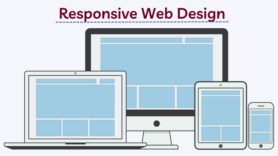
In today’s digital age, websites have become a crucial component of any business or organization’s online presence. With the rise of mobile devices and varying screen sizes, it is essential to ensure that your website is accessible and visually appealing across different platforms. This is where responsive web design comes into play. In this blog, we will explore the numerous benefits of responsive web design and how it can enhance user experience.

Table of Content
- Responsive Web Design Importance
- What is Responsive Design
- Key Components of Responsive Design
- Top 5 Benefits of Responsive Web Design
- Conclusion
- FAQ
Responsive Web Design Importance
Responsive web design has become an indispensable foundation for achieving online success in today’s digital landscape. Now, let’s explore the crucial reasons why responsive web design holds immense significance:
1. Mobile Device Usage: As smartphones and tablets continue to dominate the digital realm, a substantial portion of internet users access websites through mobile devices. Responsive web design ensures that your website is optimized for mobile viewing, providing an exceptional user experience across all devices. This is vital for capturing and retaining the attention of mobile users who expect seamless browsing.
2. Adaptability: Responsive web design empowers your website to adapt effortlessly to various screen sizes and resolutions. It ensures that your website’s layout, images, and content adjust dynamically, creating a visually appealing and user-friendly experience. This adaptability eliminates the need for separate mobile versions or multiple websites, simplifying maintenance and ensuring consistent branding across devices.
3. Enhanced User Experience: A responsive website delivers a seamless and consistent user experience. Users can effortlessly navigate, read content, and interact with your website, regardless of the device they are using. By providing an optimized experience for each user, you can increase engagement, encourage longer visit durations, and boost conversion rates.
4. Search Engine Optimization (SEO): Responsive web design plays a crucial role in search engine optimization. Major search engines, such as Google, prioritize mobile-friendly websites in their search results. By adopting responsive design, you improve your chances of ranking higher in search engine result pages (SERPs), driving more organic traffic to your site. Additionally, using a single URL for both desktop and mobile versions simplifies SEO efforts and consolidates your website’s authority and backlinks.
5. Cost and Time Efficiency: Responsive web design offers cost and time efficiency benefits. With a responsive approach, you save valuable resources that would have been spent on developing and maintaining separate versions of your website for different devices. By having a unified codebase and design, you streamline the development process and make updates and modifications easier and more cost-effective. Furthermore, the responsive design eliminates the need for user redirection, resulting in reduced server load and improved page loading times.
6. Future-Proofing: With technology evolving rapidly, new devices and screen sizes are constantly emerging. Responsive web design ensures that your website is future-proof and capable of adapting seamlessly to new technologies and devices. By embracing responsive design, you can provide a consistent experience to users, regardless of the device they use to access your site. This eliminates the need for frequent redesigns or rebuilds, saving time and resources.
What is Responsive Design?
Responsive web design refers to a design approach that aims to create websites that adapt and respond to the user’s device, screen size, and orientation. It involves using fluid grids, flexible images, and CSS media queries to ensure that the website layout and content adjust seamlessly across different devices.
Key Components of Responsive Web Design
There are mainly 3 key components of Responsive web design and all the 3 components are given below.
- Fluid Grids
- Flexible Images
- CSS Media Queries
1. Fluid Grids
Fluid grids are a fundamental component of responsive web design. They refer to a flexible grid system that adjusts and scales seamlessly based on the user’s screen size and resolution. Unlike fixed-width layouts, fluid grids enable the content to flow and adapt dynamically, maintaining proportionate spacing and alignment across devices.
2. Flexible Images
Flexible images are an essential component of responsive web design. They refer to images that can adapt and scale fluidly based on the screen size and resolution of the device being used. The goal is to ensure that images are displayed optimally and maintain their quality, regardless of the viewing environment.
3. CSS Media Queries
Media queries are an essential component of responsive web design, allowing you to apply different styles and layouts based on specific device characteristics such as screen size, resolution, orientation, and more. They play a crucial role in creating a seamless and tailored user experience across various devices. One important type of media query is the screen size (SS) media query, which specifically targets different screen sizes.
Top 5 Benefits of Responsive Web Design
There are various benefits of responsive web design. The top 5 benefits of responsive web design are given below.
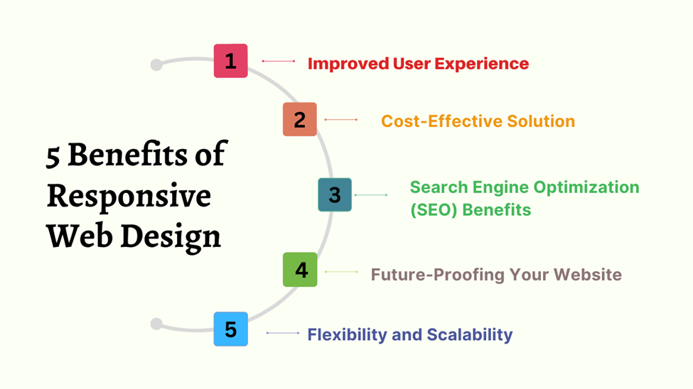
1. Improved User Experience
A. Consistent Visual Appeal
Responsive web design ensures that your website looks visually appealing and consistent across all devices. By adapting to different screen sizes, fonts, and layouts, users have a seamless experience and can easily navigate through your website.
B. Enhanced Accessibility
The responsive design promotes accessibility by accommodating users with disabilities or impairments. It allows for better readability, proper scaling of content, and compatibility with assistive technologies, ensuring equal access for all users.
C. Seamless Navigation
A responsive website provides intuitive and user-friendly navigation across devices. By adapting to different screen sizes, menus, and navigation elements are optimized for touch-based interactions, making it easier for users to find and access the desired information.
D. Faster Loading Times
Responsive design helps optimize website performance by eliminating the need for separate mobile versions. As a result, users experience faster loading times since the website only needs to load once, regardless of the device they are using.
2. Cost-Effective Solution
A. Single Design, Multiple Devices
With a responsive design, you only need to create and maintain one version of your website. This eliminates the need for separate mobile sites, saving time, effort, and resources that would have been spent on managing multiple versions.
B. Reduced Development and Maintenance Costs
Responsive web design streamlines the development process, eliminating the need to build and maintain separate codebases for different devices. With a unified codebase, developers can efficiently implement updates, fix bugs, and ensure consistency across all platforms.
C. Increased Conversion Rates and Revenue
A responsive website provides a better user experience, leading to increased engagement and higher conversion rates. By offering a seamless and convenient browsing experience, the responsive design encourages visitors to stay on your site longer, explore more pages, and complete desired actions, ultimately boosting your revenue.
3. Search Engine Optimization (SEO) Benefits
A. Google’s Mobile-First Indexing
Google prioritizes mobile-friendly websites in search engine rankings. With responsive web design, your site is more likely to be recognized as mobile-friendly and receive a higher ranking in search results.
B. Higher Rankings and Visibility
Responsive design contributes to better SEO performance by consolidating your website’s authority and backlinks onto a single URL. This helps search engines understand and index your content more effectively, resulting in improved visibility and higher search rankings.
C. Lower Bounce Rates
A responsive website reduces bounce rates by providing a seamless user experience across devices. When users can easily navigate and access the content they are looking for, they are more likely to stay on your site, reducing the bounce rate and increasing the chance of conversions.
4. Future-Proofing Your Website
A. Adapting to Emerging Technologies
Responsive web design ensures that your website is prepared for future technological advancements. As new devices and screen sizes emerge, your responsive site will automatically adapt, saving you from the hassle and cost of rebuilding or redesigning your website.
B. Catering to Growing Mobile Usage
The prevalence of mobile devices continues to grow, and more people are using smartphones and tablets to browse the internet. By adopting responsive web design, you can cater to this mobile-centric audience, ensuring that your website is accessible and user-friendly across various mobile devices.
C. Staying Ahead of the Competition
Responsive web design is now an industry standard, and businesses that fail to embrace it risk falling behind their competitors. By implementing responsive design, you can provide a superior user experience and gain a competitive edge in the online marketplace.
5. Flexibility and Scalability
A. Easy Content Management
With responsive web design, content management becomes more efficient and straightforward. Since you have a single website to maintain, updating and managing content becomes a streamlined process, saving time and effort.
B. Compatibility with New Devices
New devices and screen sizes are constantly being introduced. By adopting responsive design, you ensure that your website remains compatible and accessible to users regardless of the device they are using, whether it’s a smartphone, tablet, laptop, or even emerging technologies like smartwatches or virtual reality devices.
C. Streamlined Updates and Modifications
Making updates or modifications to a responsive website is simpler and more cost-effective. Instead of having to make changes separately for each device, you can implement updates universally, ensuring consistency and saving time in the development process.
Conclusion:
Investing in responsive web design is no longer optional; it has become a necessity to cater to the diverse needs of users across multiple devices. By adopting a responsive approach, businesses can ensure a consistent and engaging user experience, increase their online visibility, and stay ahead of the competition. The benefits of responsive web design, such as improved user experience, cost-effectiveness, search engine optimization advantages, and future-proofing, make it an indispensable aspect of modern web development. So, if you want to create a website that truly stands out, embraces responsive web design, and delivers a seamless experience to your audience.
FAQ
Ans – In the ever-expanding realm of mobile devices, responsive web design emerges as a pivotal necessity. Its significance lies in its ability to transform websites into accessible havens of user-friendliness and visual allure across smartphones, tablets, and desktops alike. With a responsive design in place, websites not only capture attention but also ascend the ranks of SEO, empowering businesses to thrive. Moreover, it simplifies the development and maintenance journey, allowing for streamlined processes. Ultimately, responsive web design breathes life into the user experience, ensuring it remains nothing short of exceptional.
Ans – The loading speed of responsive websites can fluctuate due to factors such as content size, server response time, and optimization techniques employed. Nevertheless, by adhering to best practices such as optimizing images, minifying code, and implementing effective caching strategies, responsive websites can achieve impressive loading times on both desktop and mobile devices. These optimization efforts ensure that visitors are greeted with swift and seamless experiences, fostering engagement and satisfaction.
Ans – Absolutely! Converting an existing website to a responsive design is indeed possible. However, the level of complexity involved largely relies on the website’s current structure and underlying code. The process may entail reorganizing content, adjusting layouts, and implementing responsive CSS techniques. These measures are crucial in ensuring a smooth and flawless transition to a responsive design, allowing your website to effortlessly adapt to various screen sizes and devices.
Ans – Indeed! Responsive web design holds exceptional significance for e-commerce websites, particularly because it paves the way for a seamless shopping experience across devices. By implementing responsive design principles, product images, descriptions, and the checkout process can gracefully adapt to diverse screen sizes. This adaptability empowers users to shop conveniently, regardless of the device they are using. Consequently, the enhanced user experience increases the likelihood of conversions, propelling the success of e-commerce ventures.
Ans – Exploring the responsiveness of a website can be accomplished through various avenues. You have the option to manually resize your browser window and observe how the layout adapts and adjusts accordingly. Alternatively, utilizing the developer tools available in browsers allows you to simulate different devices, providing insights into how your website appears on varying screens. Additionally, online tools and services are readily available, offering comprehensive responsive design testing across diverse devices and screen sizes. These approaches collectively empower you to evaluate and fine-tune the responsiveness of your website with ease.